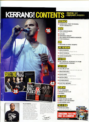
In contents page of 'Kerrang' magazine, the contents list runs along the right hand side of the magazine showing their 'regulars' at the top of the page and 'features' at the bottom. The colour scheme is similar to the from cover, and the yellow is used to bring your attention to the different regulars and features they have on offer similar to the front cover e.g 'news, posters, gig guide'. The contents pages main image links with the article 'heavy fest', but 2 other images show the double page spreads of other articles to make it easier for the reader to find and give them an idea what the article is about. I think compared to magazine such as Q, that that contents page is very practical and tell you easily where to find what your looking for. The contents page also contains things such as a message from the editor and a picture of him, giving more con nations of a rock genre. Overall the front cover and contents page of Kerrang easily shows that the magazine is of a Rock/Punk Genre.
This double page spread form 'Kerrang!' magazine is for the band 'You me at Six'. The double page spread shows a picture of the bands lead singer Josh, and information introducing the article on the opposite page. The colour scheme and style is very similar to the front cover, backing up the idea that the front cover of 'Kerrang!' wasn't designed to just look good, it was to reinforce the idea that the band want to be perceived in a different way. Certain things such as the font looks like is been splattered onto the wall to give a rough and messy effect. The pose that the lead singer is made to do could also give con nations of rough and violent. The font is still very bold and upper case, and the red is used to make certain ares stand out such as when there mentioning the bands name at the begging of the article and when repetition is used with the word 'six' out of you me at six. The repetition and colour could also used to almost brainwash the people reading getting the idea into the readers head that 'You me at Six's new album isn't the same as their older ones and 'Kerrang!' readers who might not have necessarily bought the magazine or read the article might be encouraged to do so due to the change in style.
Overall, looking at the front over, contents page and double page spread for 'Kerrang!' magazine that the target audience would be around 18-25 and the lifestyles of their readers would be going out to gigs, rock/punk music, and that they aspire to be is bands and music themselves.


No comments:
Post a Comment